Garanti Bank
it can be easy being green
Garanti Bank didn't want to get any bigger it just wanted to reward its existing customers with a distinctive new image.
- Client:
Garanti Bank - Location:
Istanbul, Turkey - Project:
Reposition existing bank - Objective:
Provide a distinctively different identity and marketing materials - Disciplines:
- print design
Garanti calls itself a “house bank” to emphasize its commitment to its customers, rather than to its profits. “Other banks want to make money. We believe we serve clients,” says Akin Ongor, Garanti’s president and chief executive officer. The bottom line has not been sacrificed to achieve this, in 1999 the bank ranked second in the world in terms of return on capital and fourth in terms of return on assets.
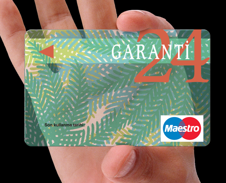
With a 4 leaf clover for a logo a green corporate color our decision to turn Garanti into Turkey’s “green” bank was pretty obvious. The way we did it was totally wholistic. Each branch was re-designed using natural materials. The waiting area had the feeling of a park with benches to sit on and large acrylic panels silkscreened with leaf patterns in the windows to produce dappled “woodland” shadows.
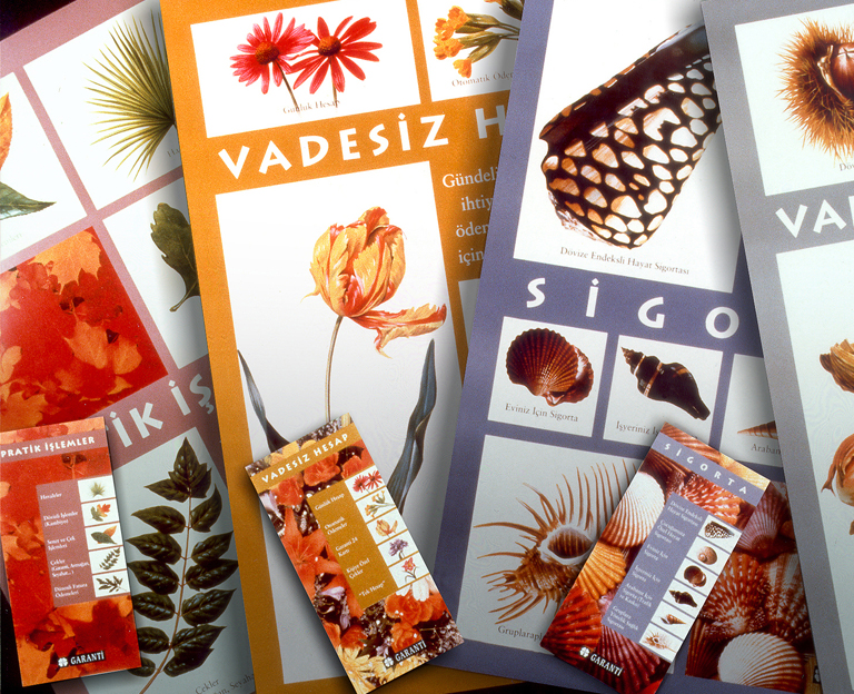
The bank’s product line was divided into five categories and each group was assigned a natural theme. Shells, a form of protection in nature, were used to promote Insurance, Investments (returns over time) represented by fruit, nuts as the theme for savings, etc.
Utilizing the design of the acrylic window panels we also produced the world’s first see-through ATM card.