Havanna
Design archaeology
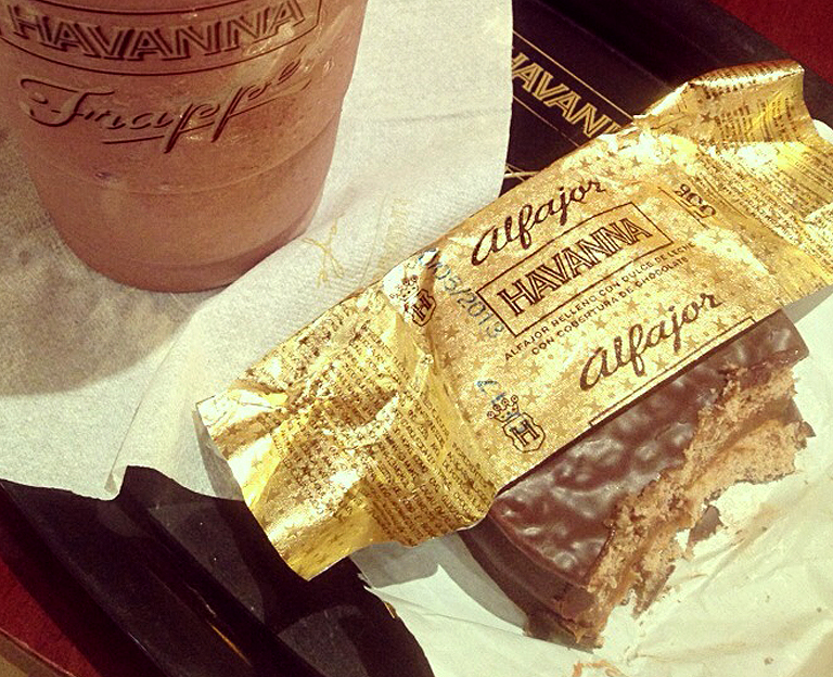
Havanna, Argentina’s leading manufacturer of cakes and cookies, was looking to expand its market share. It needed a new identity to get them there.
- Client:
Havanna - Location:
Buenos Aires, Argentina - Project:
Rationalize and upgrade existing identity, re-design of packaging ranges - Objective:
Re-design an identity without losing over 50 years of heritage - Disciplines:
- brand
- packaging design
- environmental graphics
Argentina’s great affection for Havanna and its products meant changes would have to be delicate and mistakes could cause an uproar. But like a lot 50 year old companies, small tweaks and changes over time had left the Havanna identity been severly diluted.
Our goal was to provide a fully functioning modern identity without losing any of Havanna’s esteemed history.
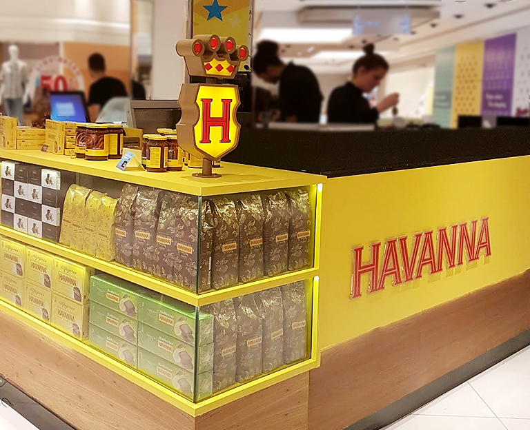
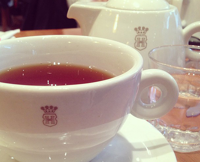
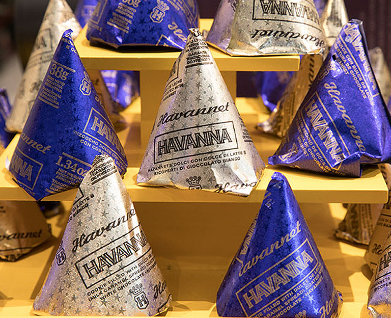
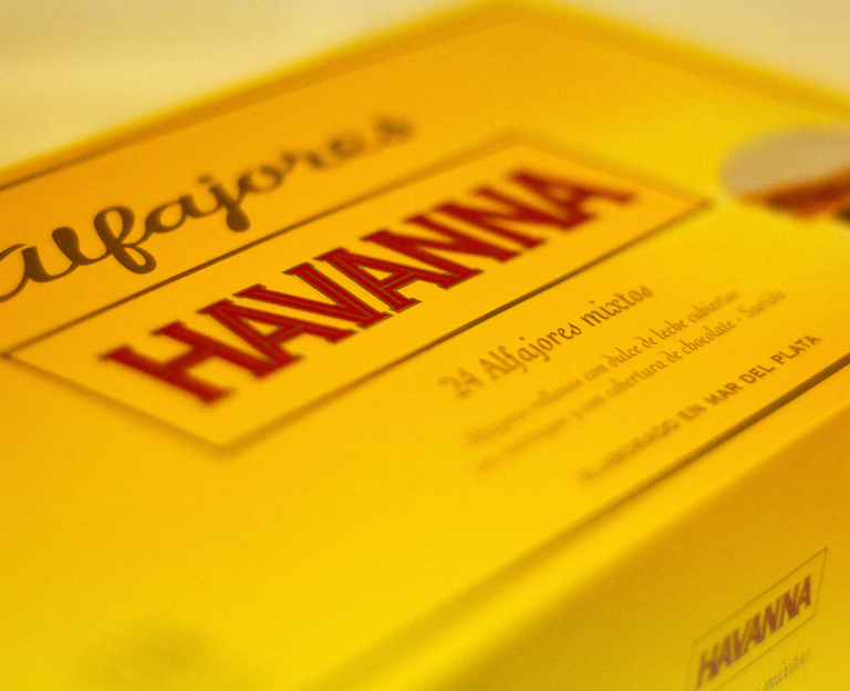
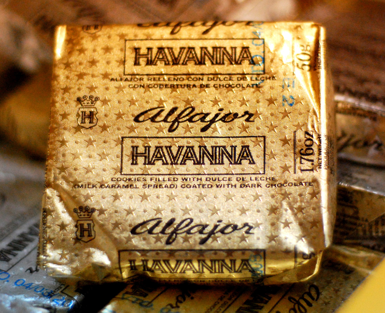
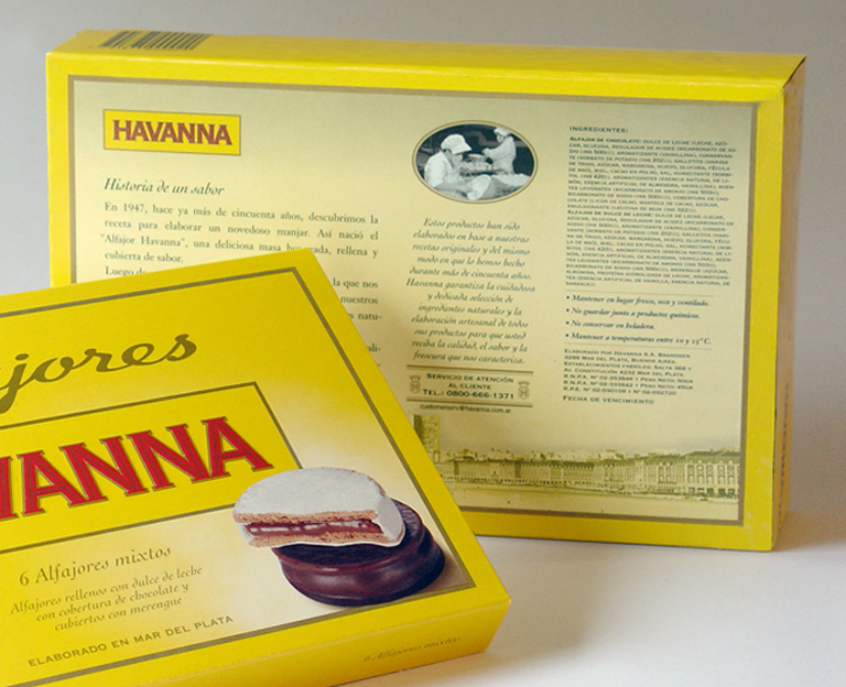
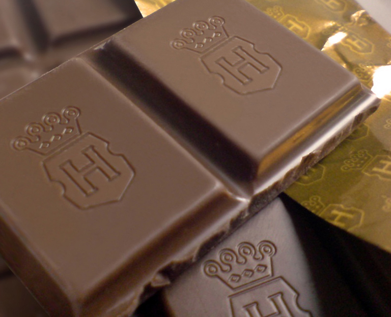
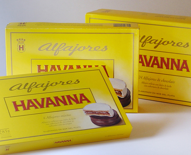
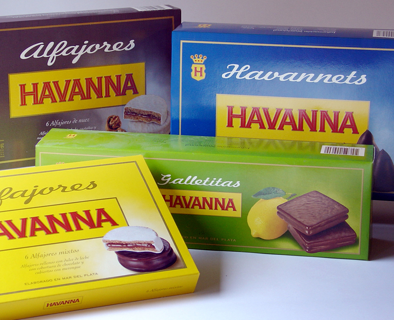
The existing logo had several color backgrounds but research showed that most people identified Havanna with the color yellow so that became the predominant corporate color. The logo and shield were simplified for better reproduction at all sizes but was refined in a way so as not to lose any of the brands original personality.
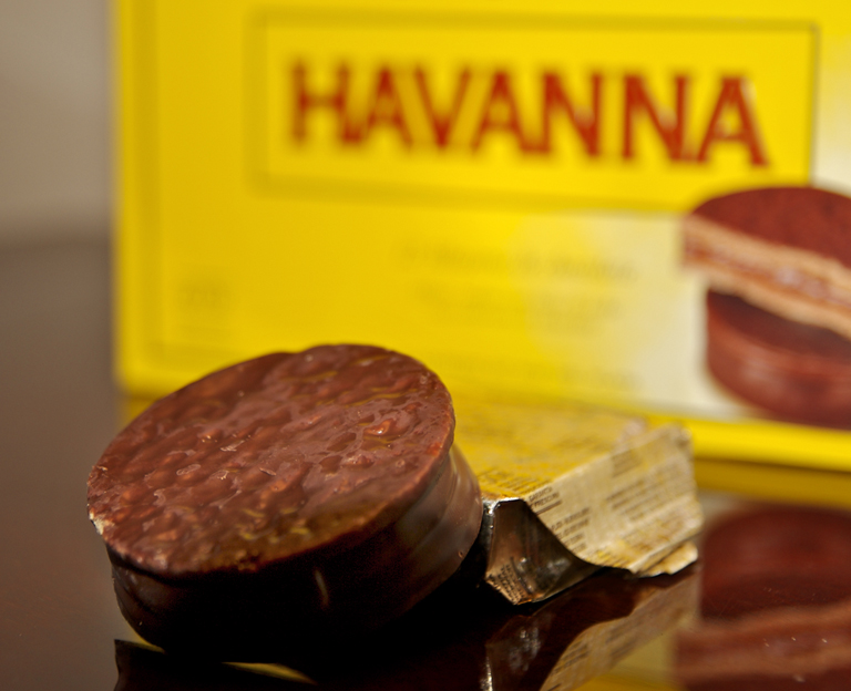
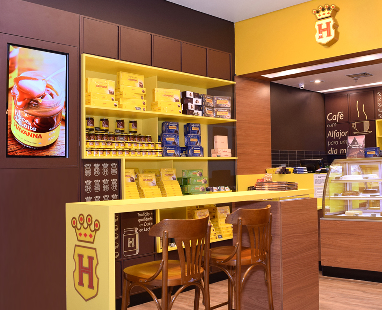
The strategy behind the redesign of their packaging was to use the best elements of ‘yesterday, today and tomorrow’. We formalized the look across several product lines and introduced seductive product photography to increase impulse purchases and ‘appetite appeal’.
Although sales and market domination increased after the redesign, most Argentinians will swear Havanna packaging has not changed in 50 years — which was our objective all along.
Havanna is currently Argentina’s 4th most recognizable brand.