Swiss Army
will the real Swiss Army please stand up
Swiss Army is a great brand name but both Wenger and Victorinox have the right to use it. So how do you get greater recognition for yourself without helping your closest competitor?
- Client:
Swiss Army Brands Inc. - Location:
Shelton, Connecticut - Project:
Re-design packaging - Objective:
Develop a distinctive differential from the main competitor with the same name - Disciplines:
- strategy
- packaging design
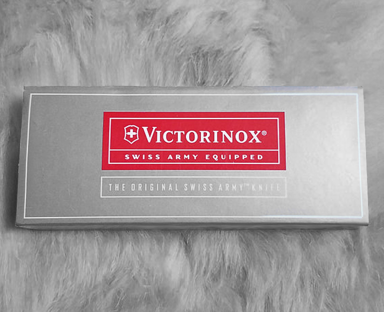
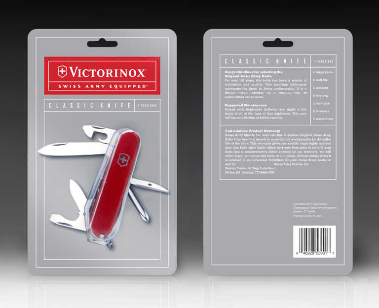
Swiss Army Brands, the Victorinox representative in the US, sought to differentiate itself from its closest rival by developing a distinct but appropriate image for its packaging and marketing.
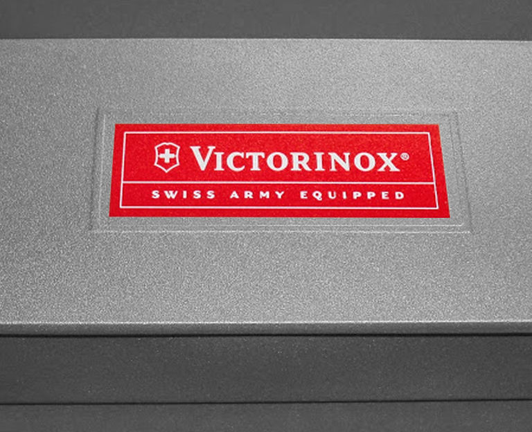
The marketing theme ‘Swiss Army Equipped’ was established by their advertising agency and our role was to interpret that into packaging for all their product ranges.
The brand attributes such as ‘simple’, ‘functional’, ‘useful’ and ‘clever’ drove the design direction. The result was an army style ration tin for the pens, watches and sunglasses with matching silver packs for the knives. We used a grid system for the graphics that was instructional and straightforward yet distinct enough to differentiate these products from Wenger.